Farm Bill Hackathon: The Results
January 18, 2012 The Farm Bill, despite its important role in shaping the food system in America, is so complex that it is little understood by most people. On December 3, 2011 the first ever Farm Bill Hackathon set out to remedy this situation. Although the term may sound ominous, a “hackathon” is simply an event where programmers gather either in person or online to collaborate on technology-based projects. In this case, the project goal was to design infographics and online tools to make the provisions and implications of the Farm Bill more understandable to the American public.
Led by media company Food+ Tech Connect, ten organizations sponsored the event, hoping to promote civic engagement, to present data to policymakers in a more tangible way, and to envision new solutions through interdisciplinary teamwork. The response was significant, with a diverse group of 120 designers, data visualizers, developers, marketing experts, food policy specialists, and USDA employees gathering in New York City to bring their infographics and online tools “from concept to execution in a single day”. In fact, in just a 12-hour period, multiple teams created five graphics and four tools, which address issues including farm subsidies, food waste, global hunger, and support to new farmers.
The process was designed to be participatory. First, Food+Tech Connect issued a Save the Date calling for ideas “for tools or visualizations that will assist you or your organization in communicating the Farm Bill’s implications to the public”. In the interests of public engagement, the organization also encouraged other groups and individuals to host their own Farm Bill hackathons. A full list of proposed topics is available here.
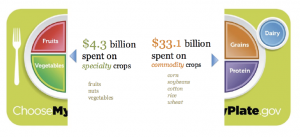
Part of the winning infographic (pictured above), depicts the disparity between the USDA Dietary Guidelines for Americans and federal farm subsidies. Given SNAP to Health’s focus on catalyzing change in the 2012 Farm Bill, the fourth place winner also merits notice. Although still a work in progress, a map is being developed that illustrates the Congressional Districts of members of the U.S. Senate and House of Representatives Agricultural Committees. “Integrating data from multiple sources, the maps will allow users to see who is on the committees, where they are from, their website and contact information and other pertinent information like who is supporting them financially and what is grown in their region,” reports Food+Tech Connect.
Prominent blogger, author, and academic Marion Nestle, Ph.D. also called for a more accessible Farm Bill document, which members of the general public can easily understand. Although readily available on the web, the language of the 663-page 2008 Farm Bill is difficult to read “because it refers to previous bills and other acts of Congress”, says Nestle.
A recent project by the Johns Hopkins Center for a Livable Future (CLF) aims to solve this very problem. CLF recently launched the Farm Bill Budget Visualizer, an interactive tool that uses “treemap” technology to demonstrate how funds from the 2008 Farm Bill were allocated across an array of issues, from conservation to commodity support to public health. This is demonstrated graphically using nested rectangles. Learn more about this innovative new tool by watching Healthy Food Action’s webinar, Visualizing Health and the Farm Bill.
Comments are closed.